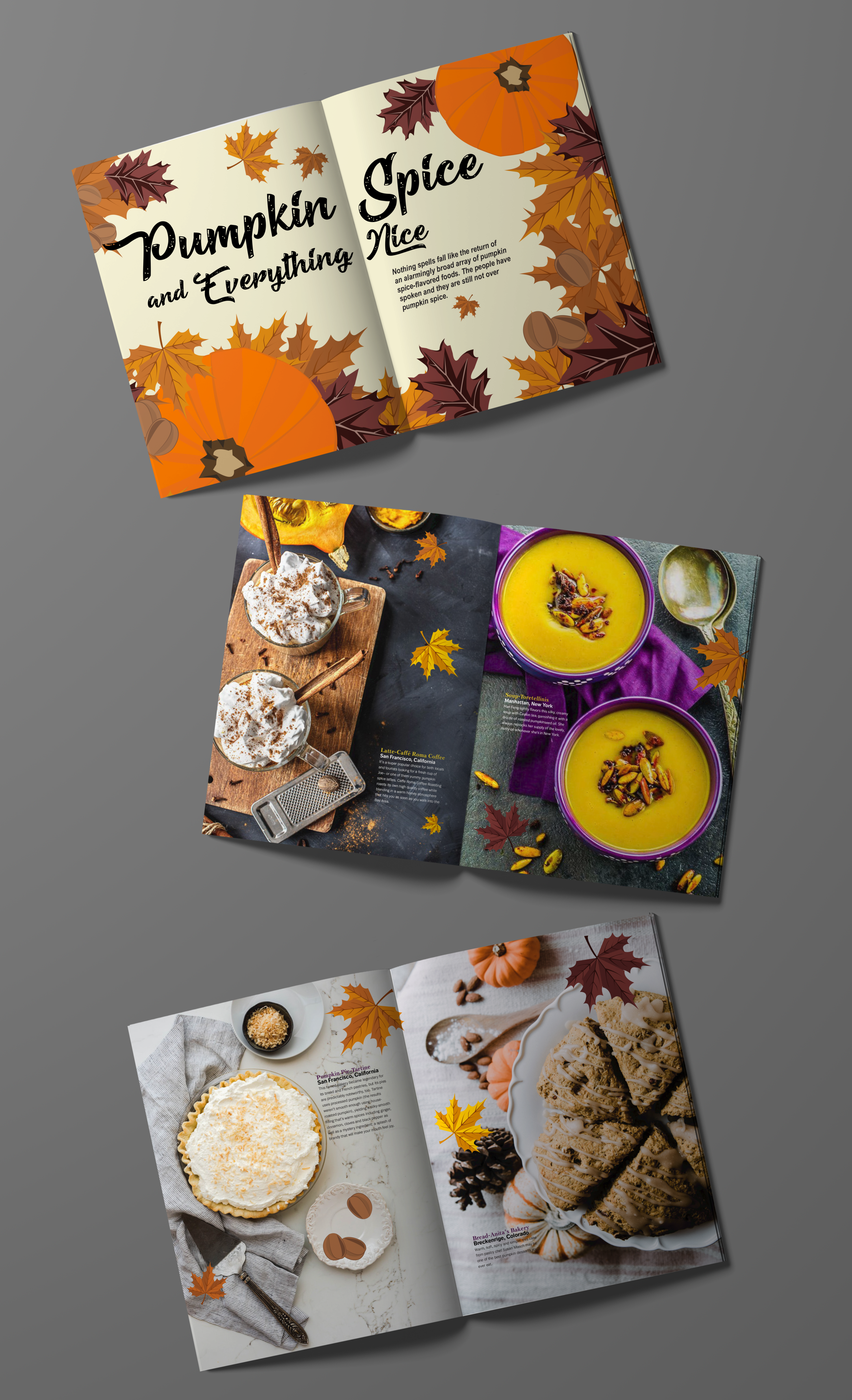
Pumpkin Spice and Everything Nice is a visual feature in Taste Tour magazine dedicated to portraying all the different dishes you can make with pumpkin spice.
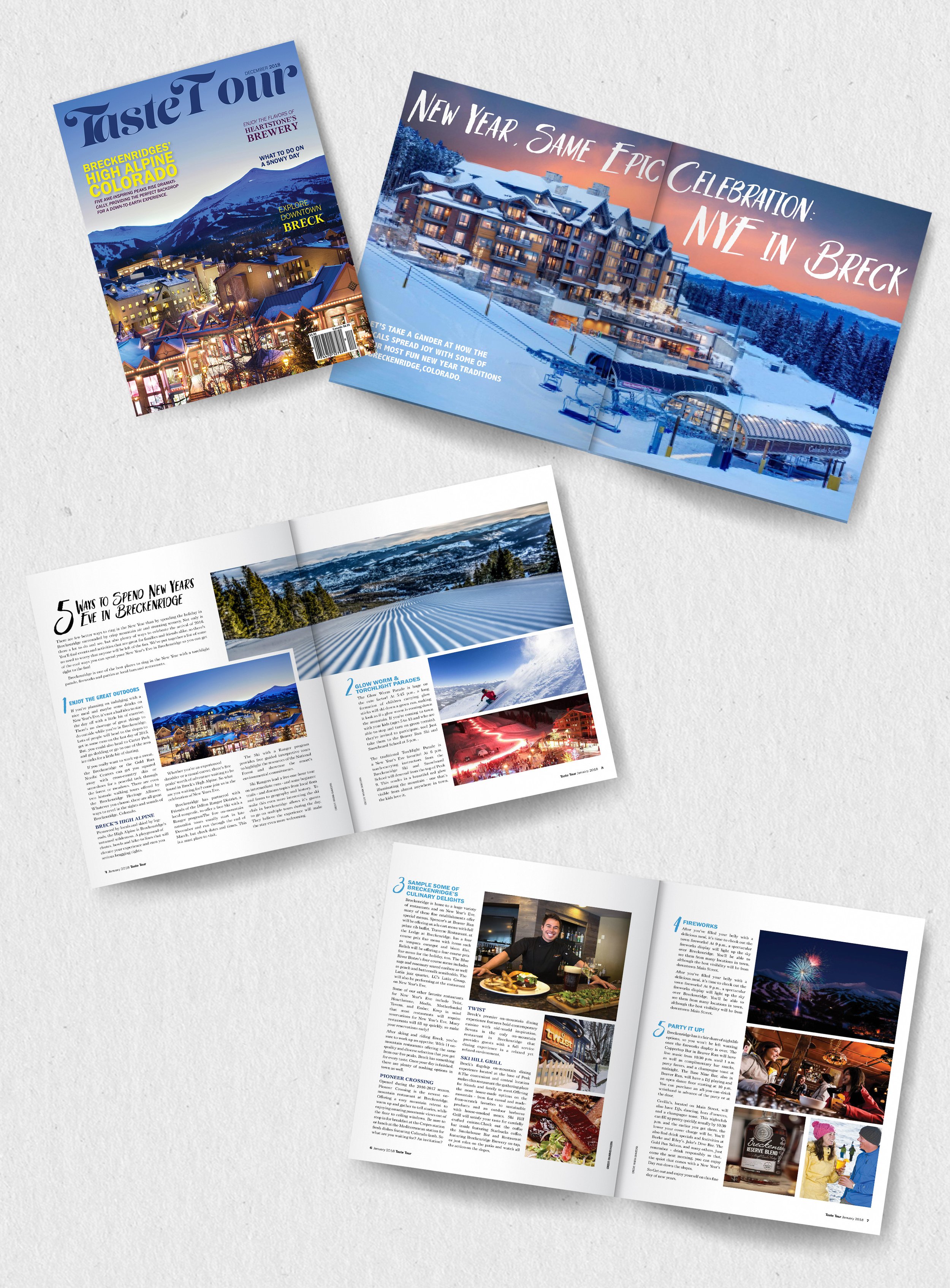
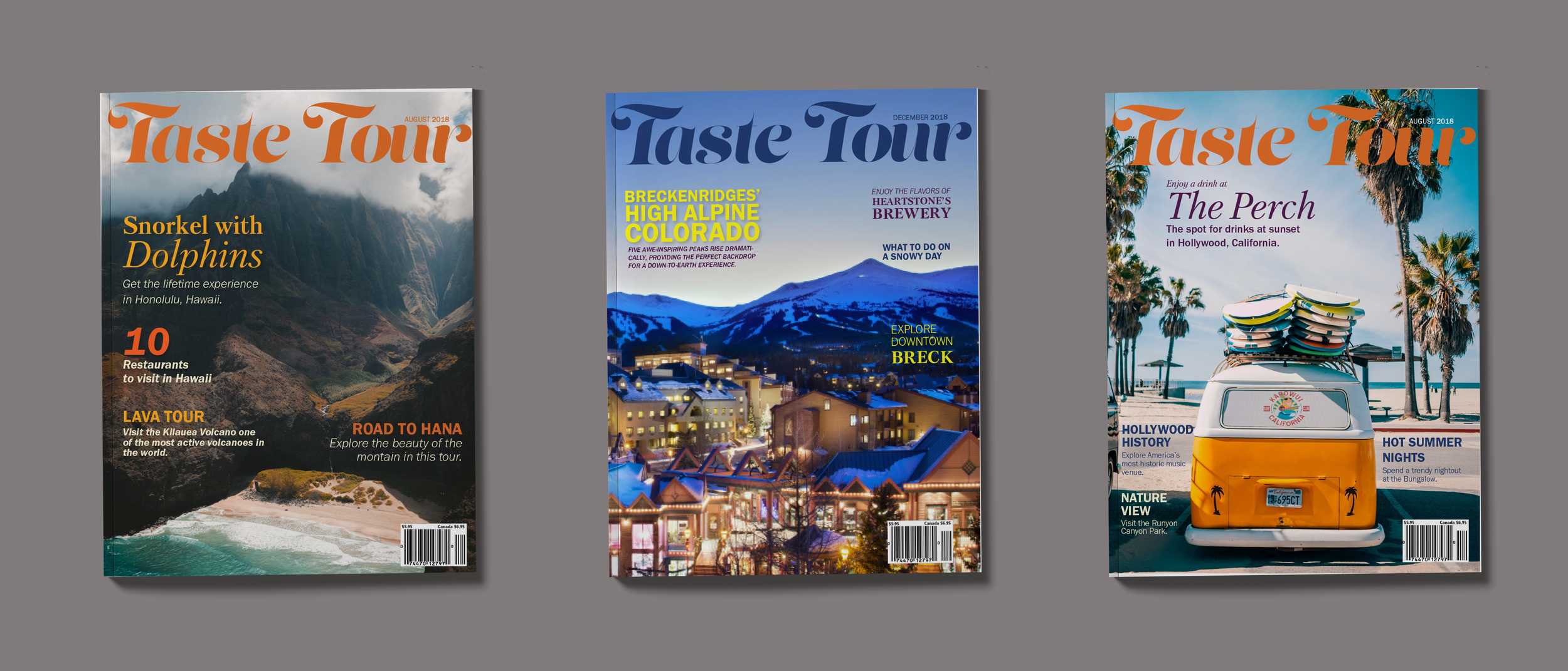
Travel magazine highlight of Breckenridge.
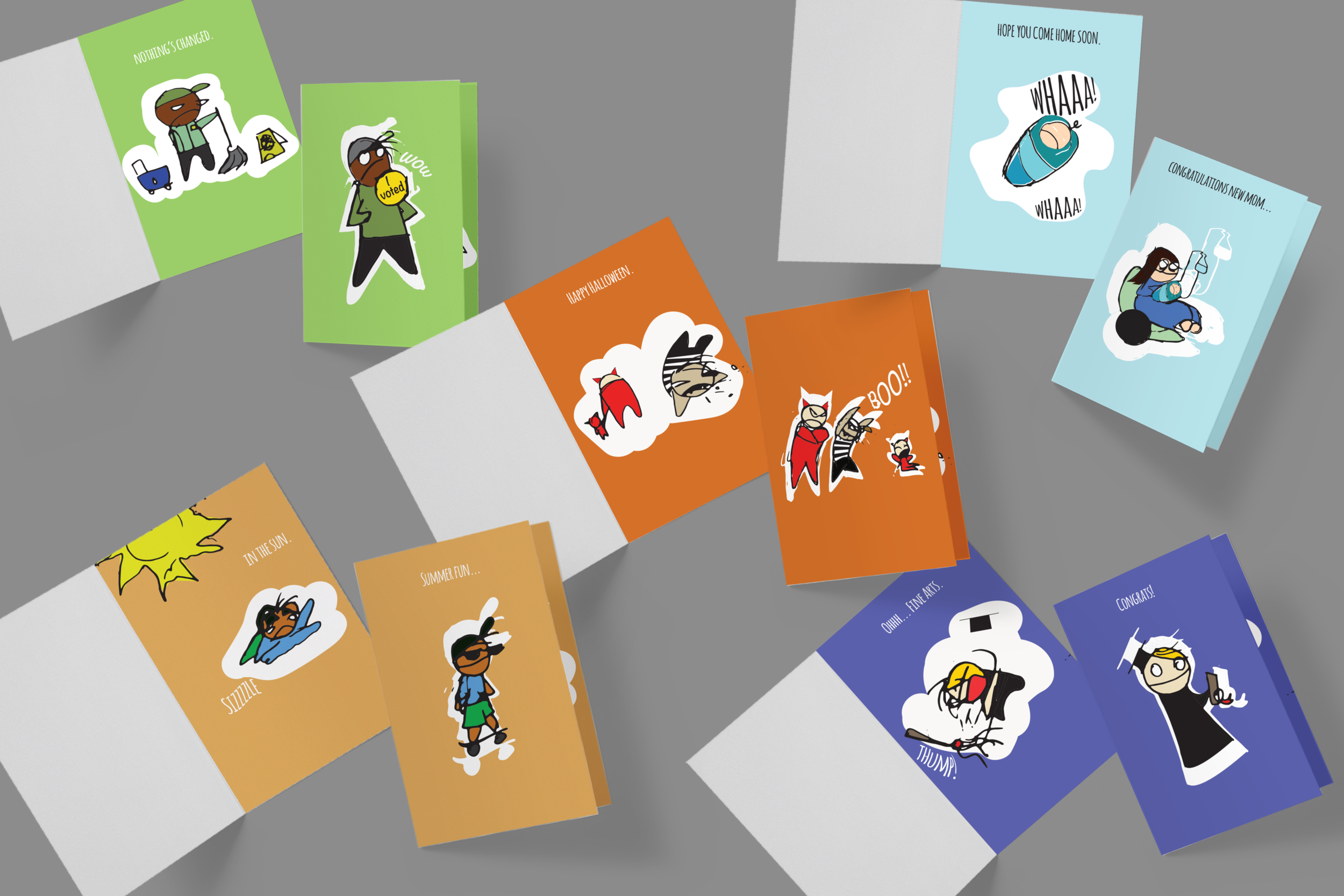
Miserable Mark is a greeting card series that I designed with my own personal drawing style. I wanted to showcase how everyday life events don’t always go as planned.
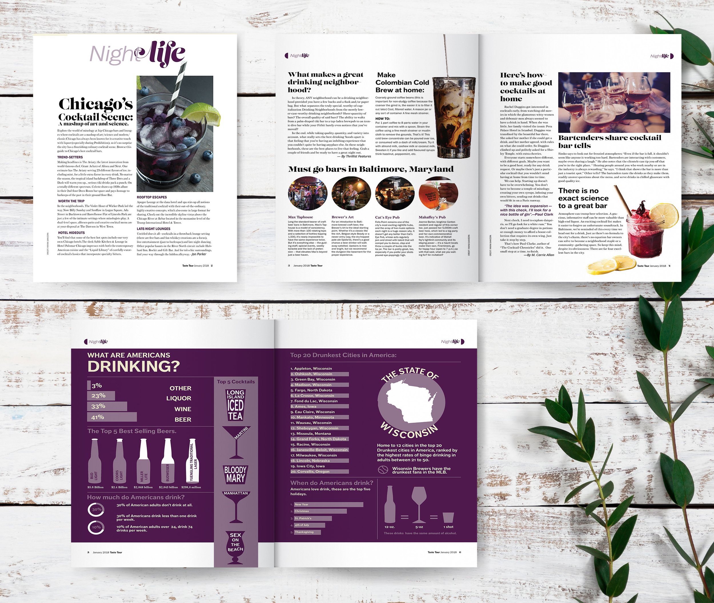
Magazine feature that highlights the nightlife in Chicago and offers some informational infographic.


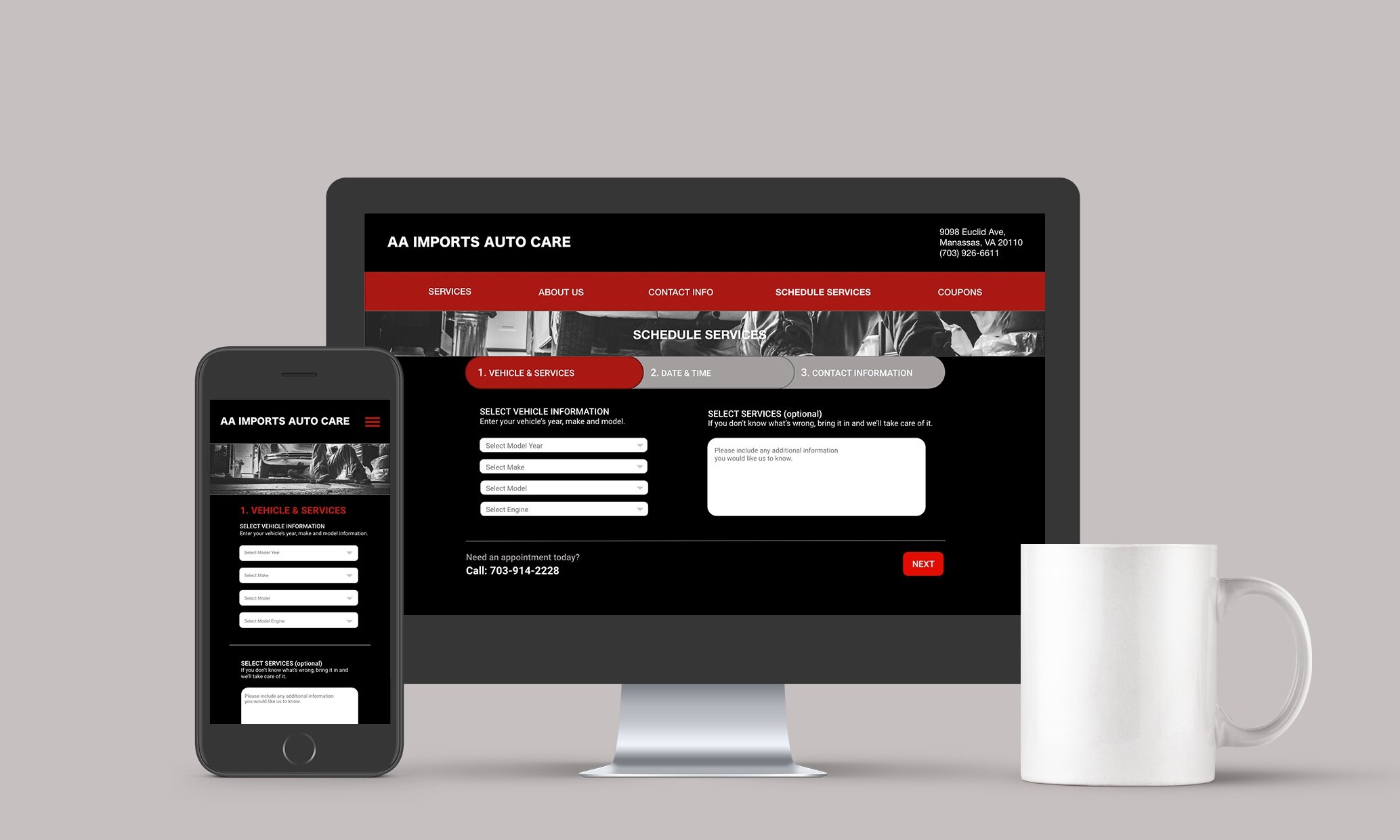
I was asked to re-brand the company AA Auto foreign and domestic car service. It is a small mom and pop shop that wanted to expand their services.
I created a completely new look and feel for the company and developed a functional website for desktop and mobile phones.

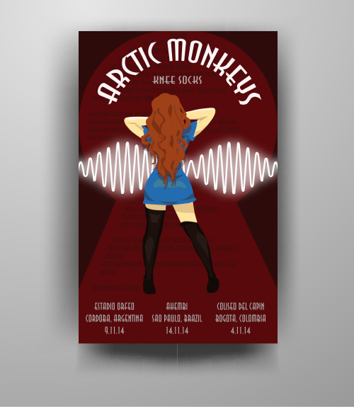
I designed this poster for a class project for one of my favorite bands Artic Monkeys.
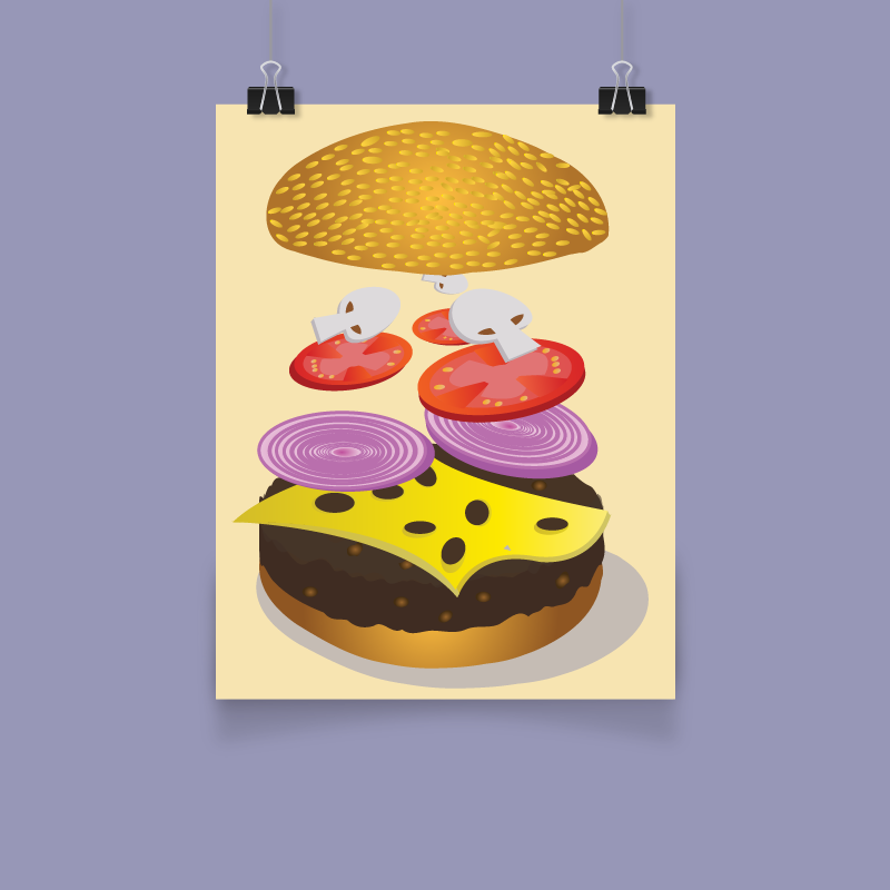
Showcasing some of my illustration skills.

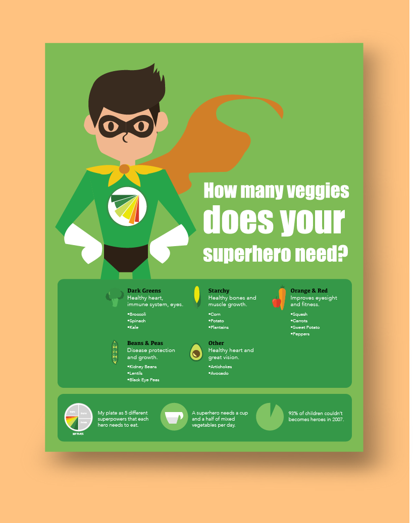
This is an infographic I designed to address the health issue of children not consuming enough vegetables in their daily diets. It was a good opportunity to educate the parents in a fun and playful way.
I did extensive research on this topic and found facts that I wanted to highlight that will get people’s attention to the health issue.
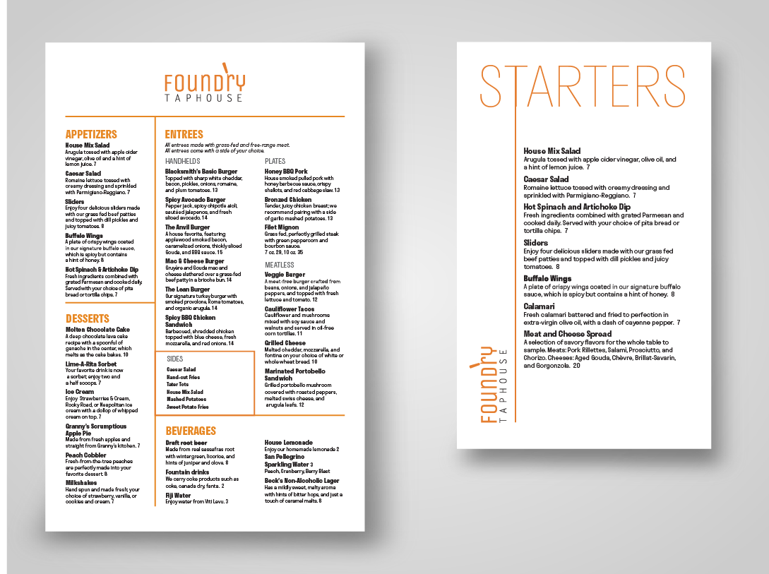
I designed multiple menus for a microbrewery company called “Foundry Taphouse”
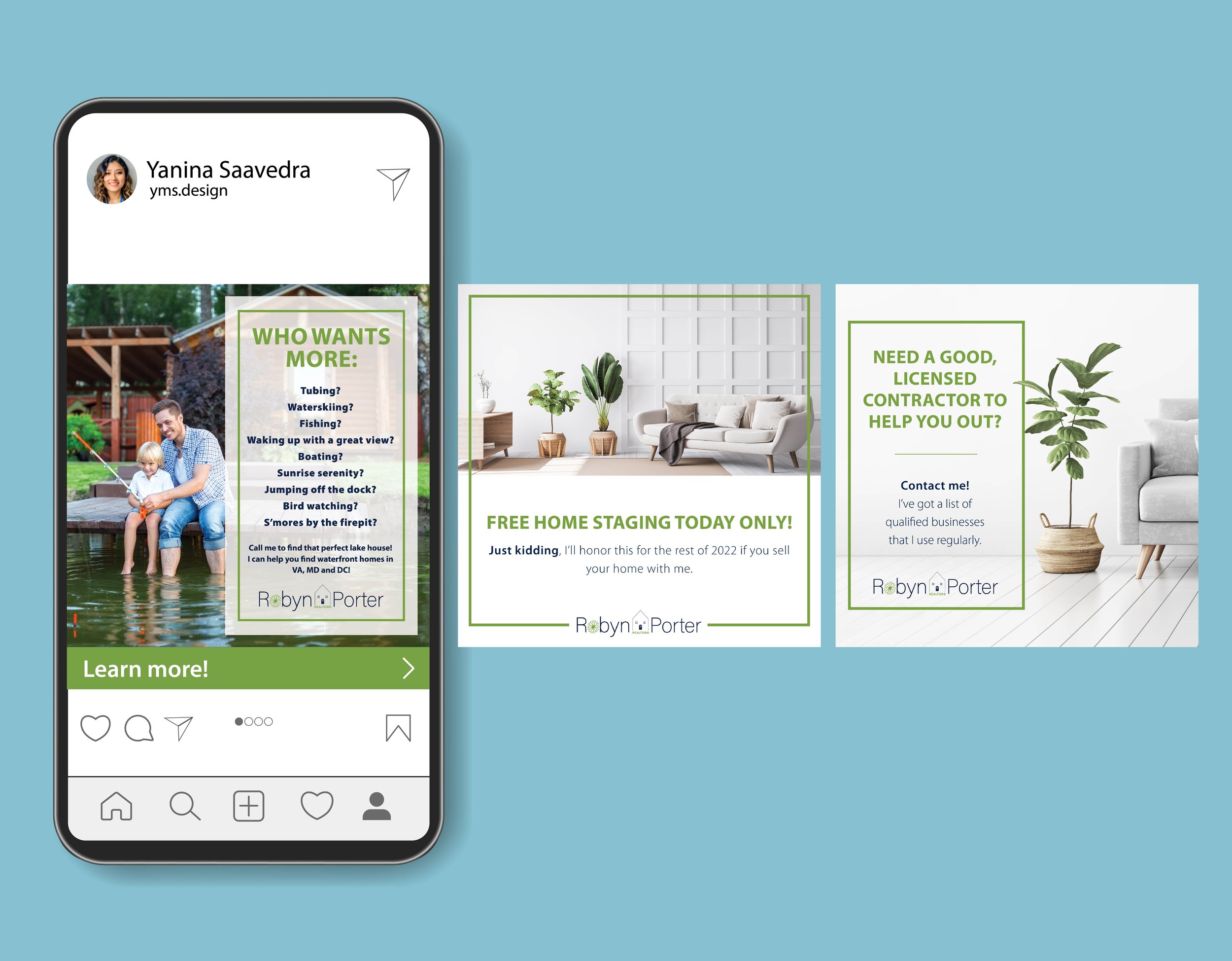
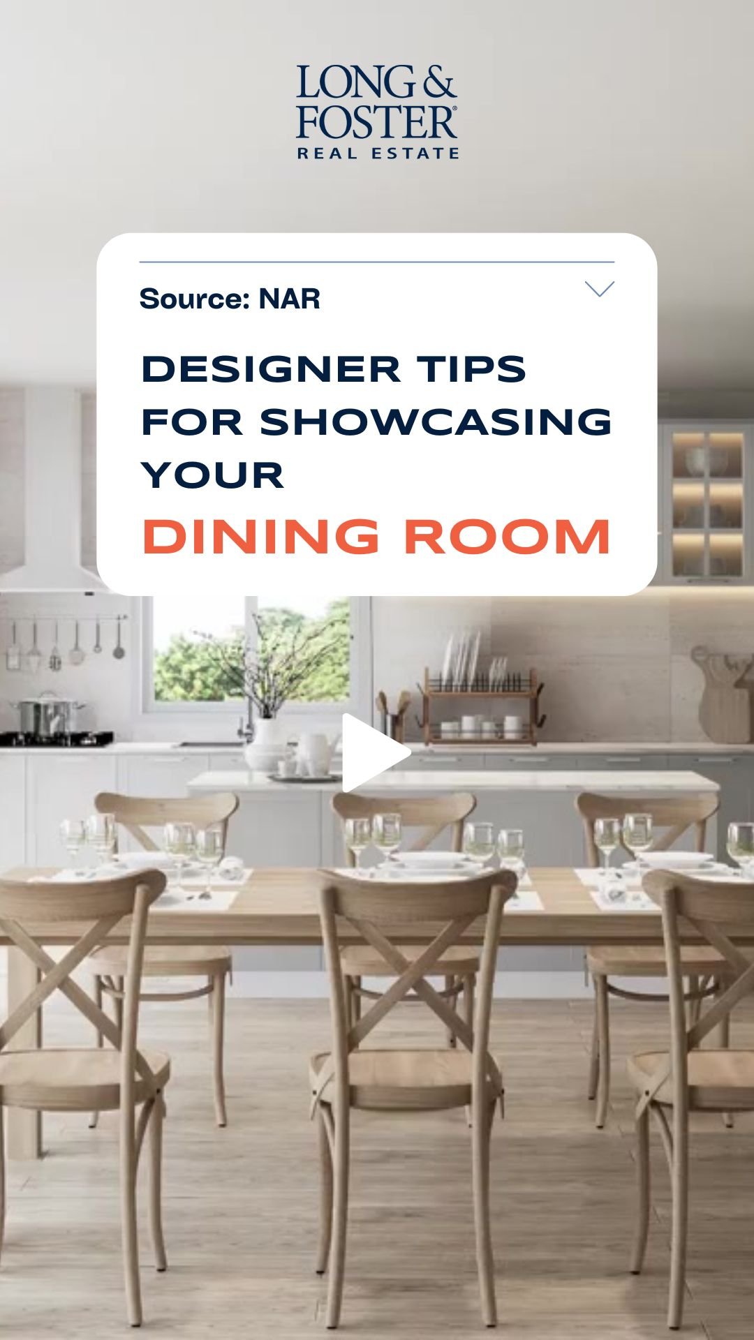
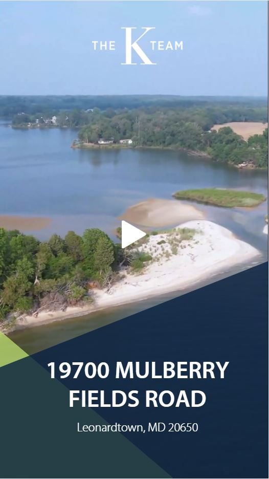
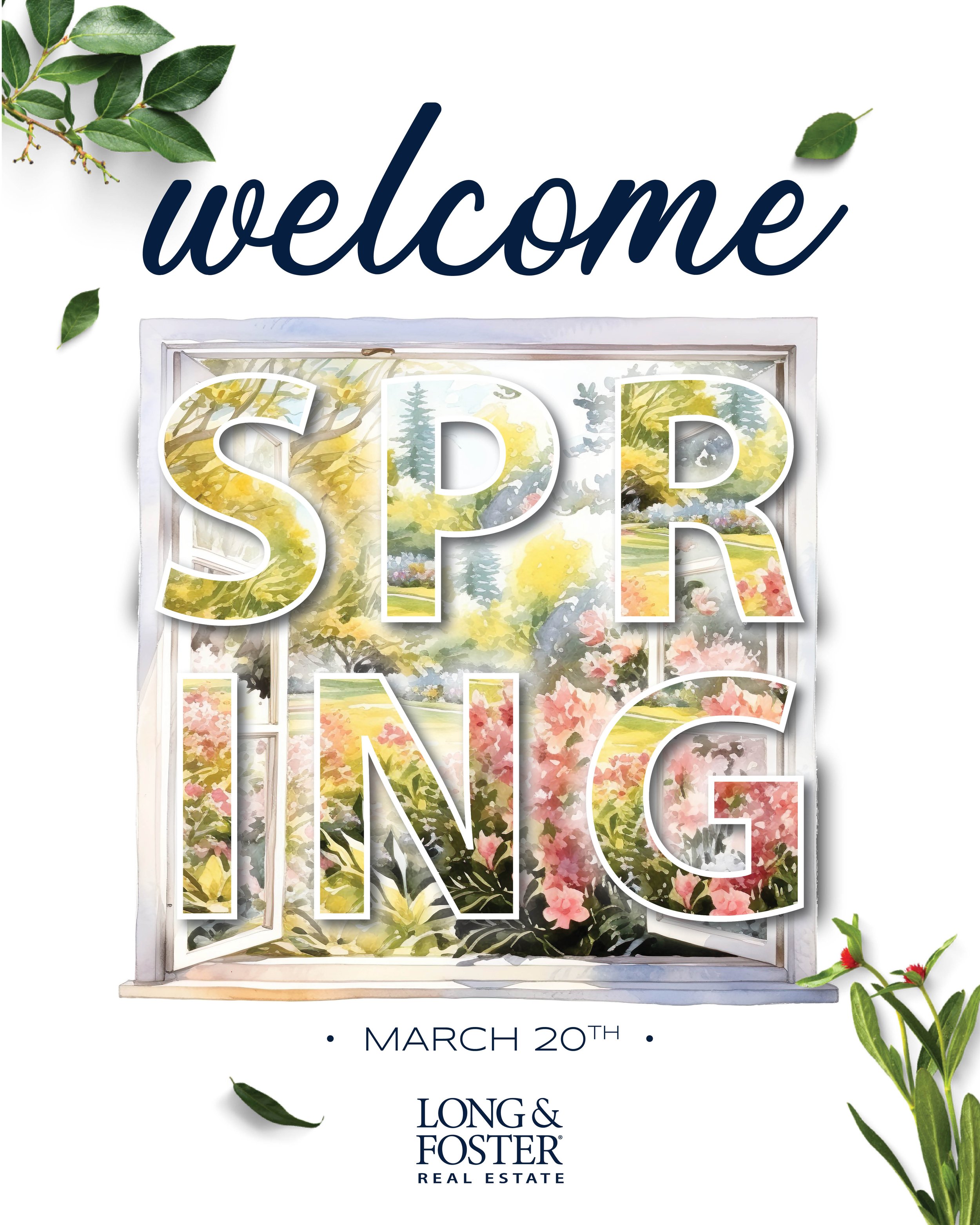
The agent wanted the look & feel of her social presence to be serene and welcoming. She wanted soft colors and images and with that in mind I established a social media presence that she loved.
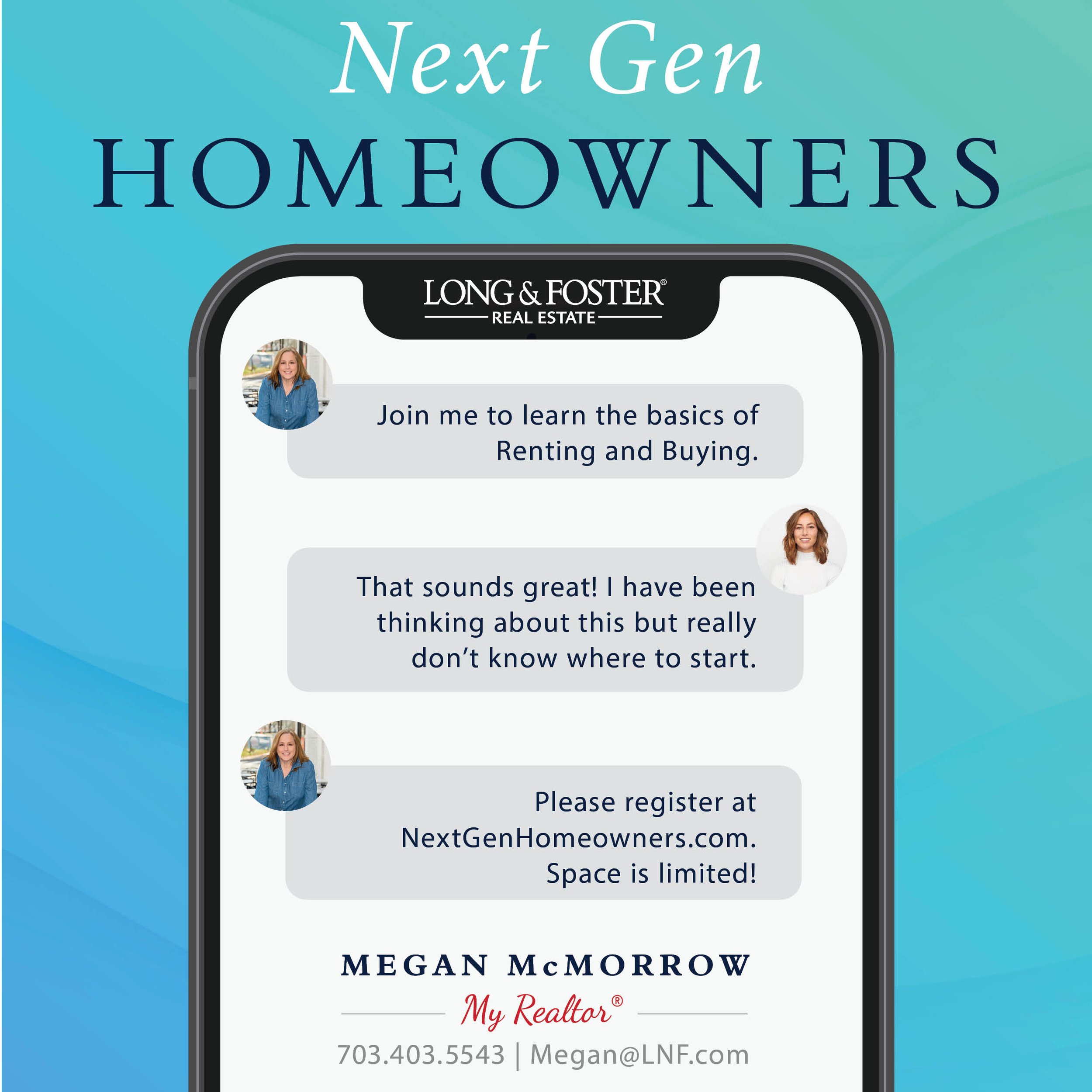
The main idea was to capture the attention of Generation Z. I wanted a more interactive short video to grab their attention and get people to go to the Event.
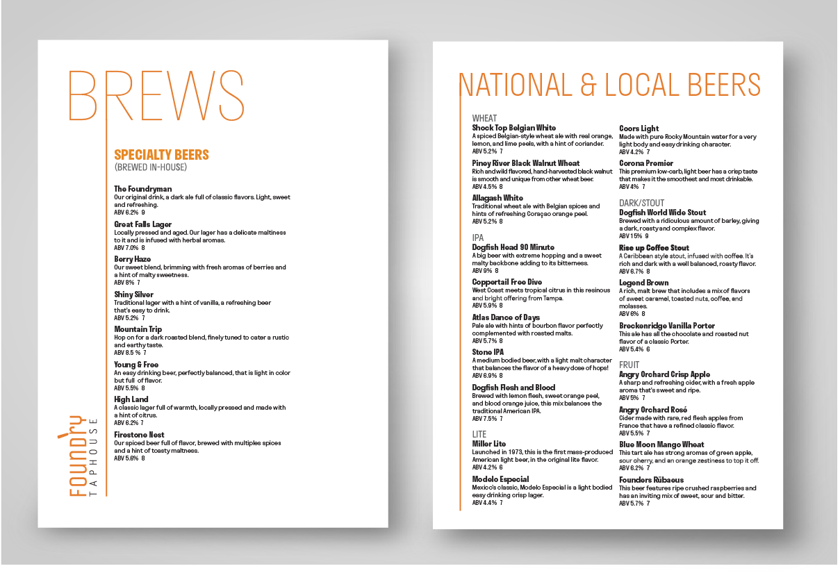
This is a front and back beer menu that showcases the in-house specialty beers. The back has all the local and national beers.
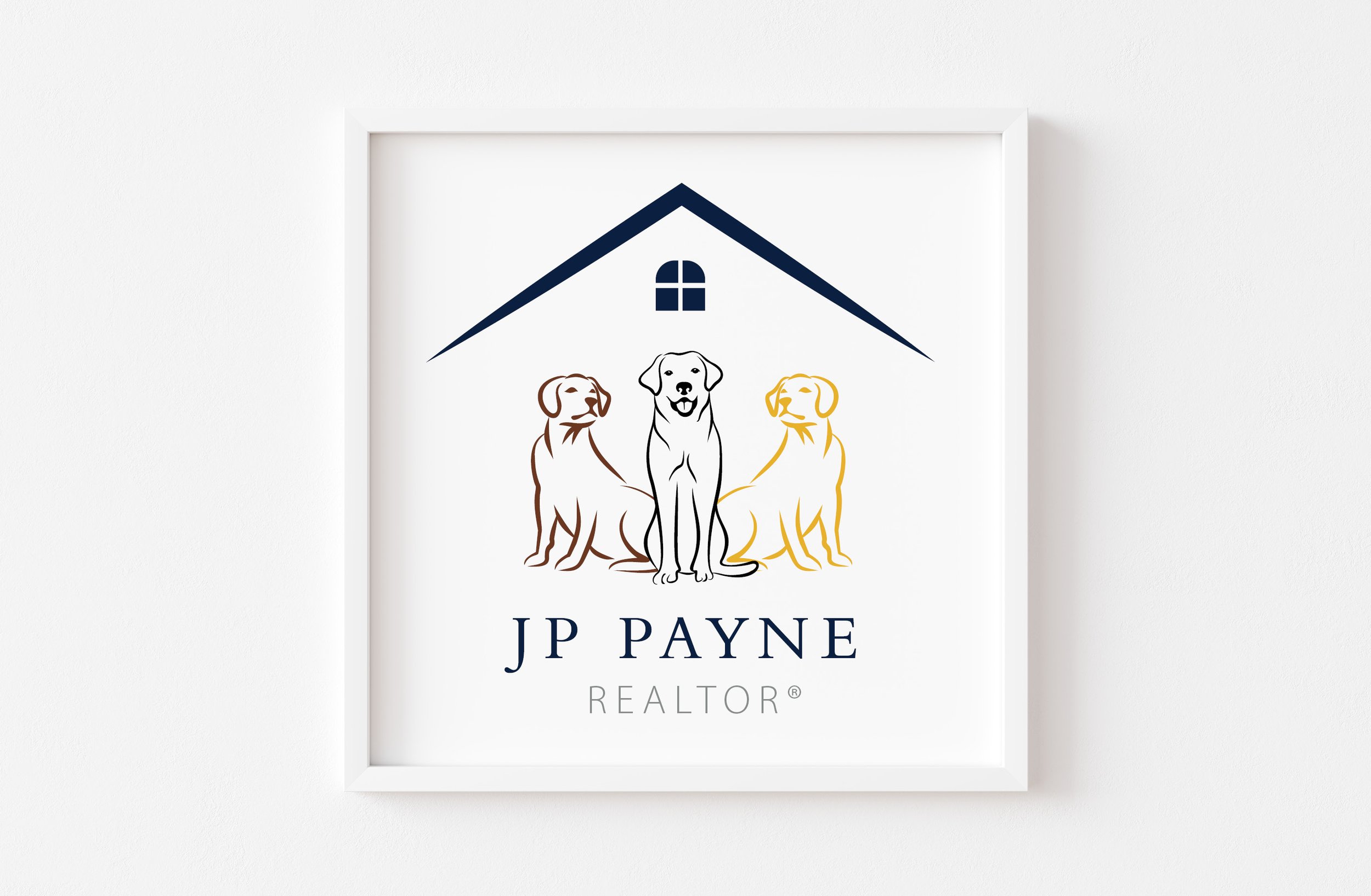
Real Estate Agent: JP Payne was looking for a logo that defined her current brand as friendly and approachable, caring, and, above all, pet loving.
As an owner of three beautiful female Labradors and busy professional, JP spent knew that her dogs made up a major part of her brand. I designed her logo in a way that included her dogs and real estate. A small challenge that I faced was with making sure that whoever saw the logo knew immediately that it was about real estate and not a “pet shop” or “grooming salon” , etc.
Her current logo features her dogs inside of a roof and is used on invoices, t-shirts, business cards, and social media.
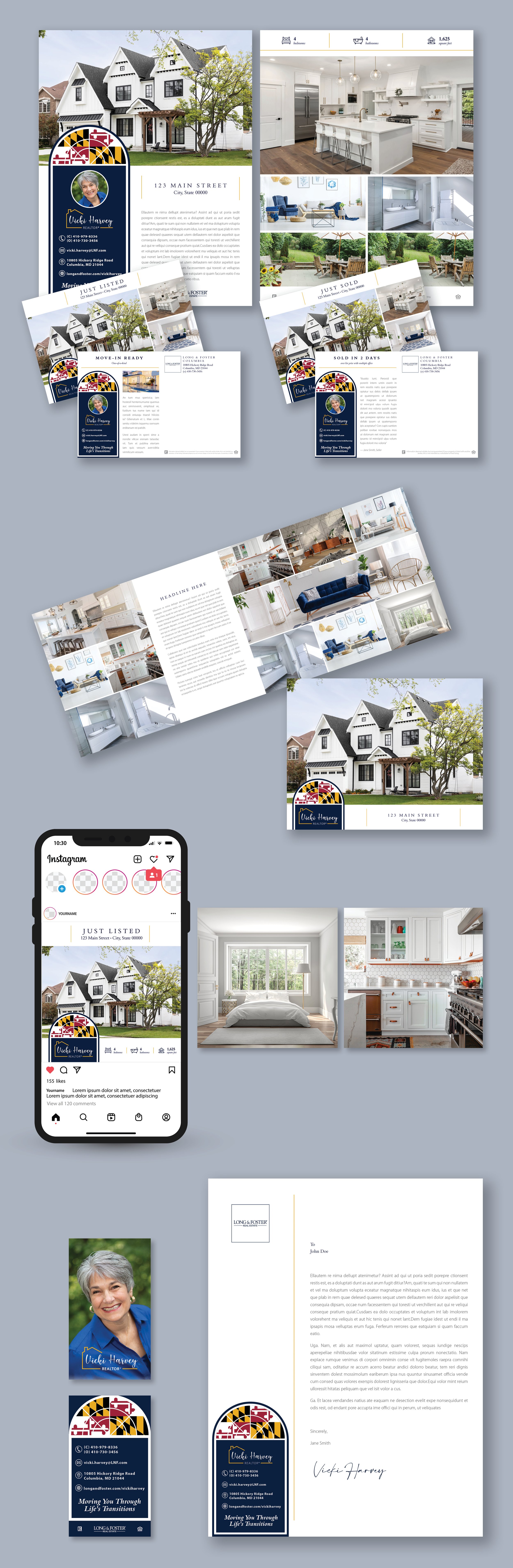
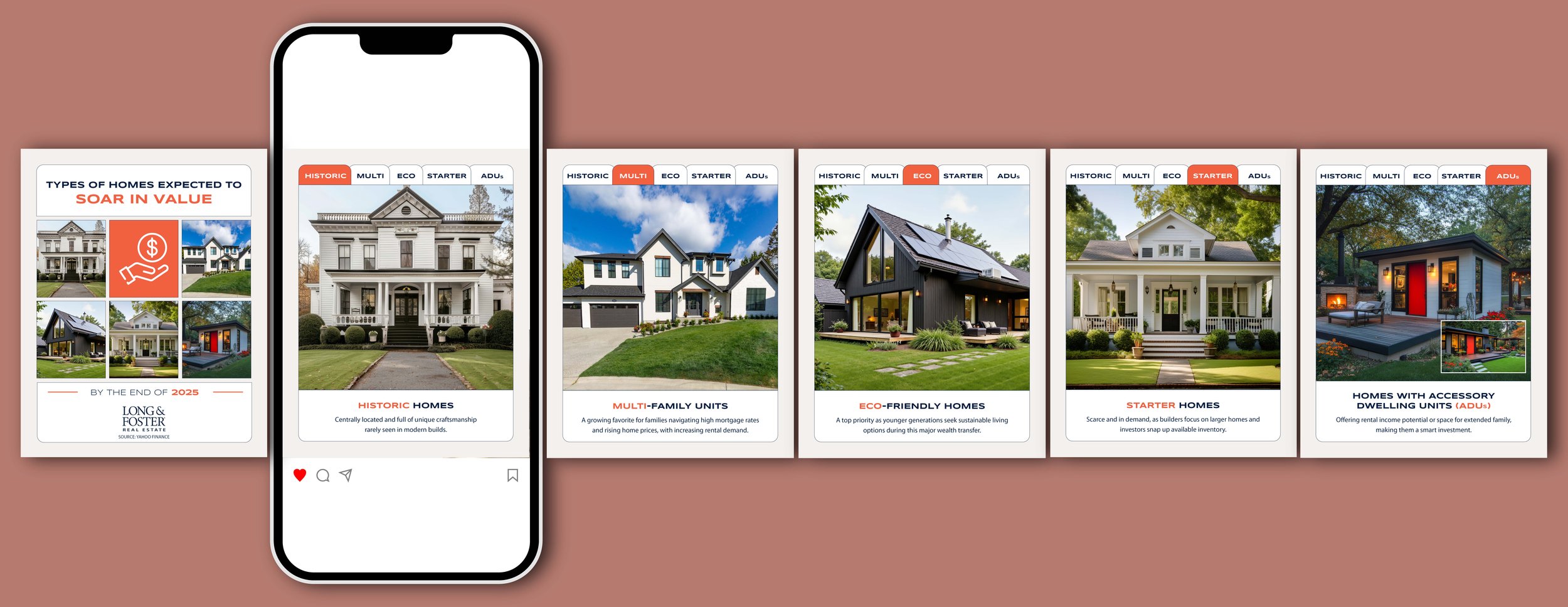
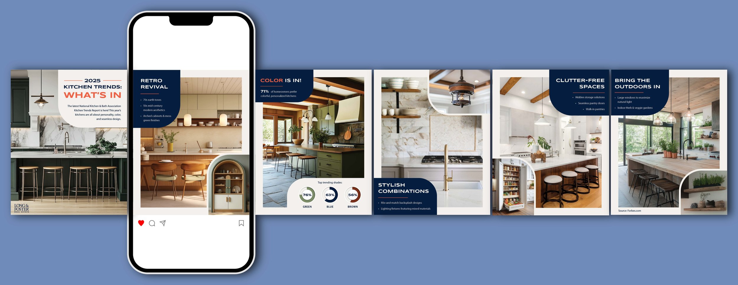
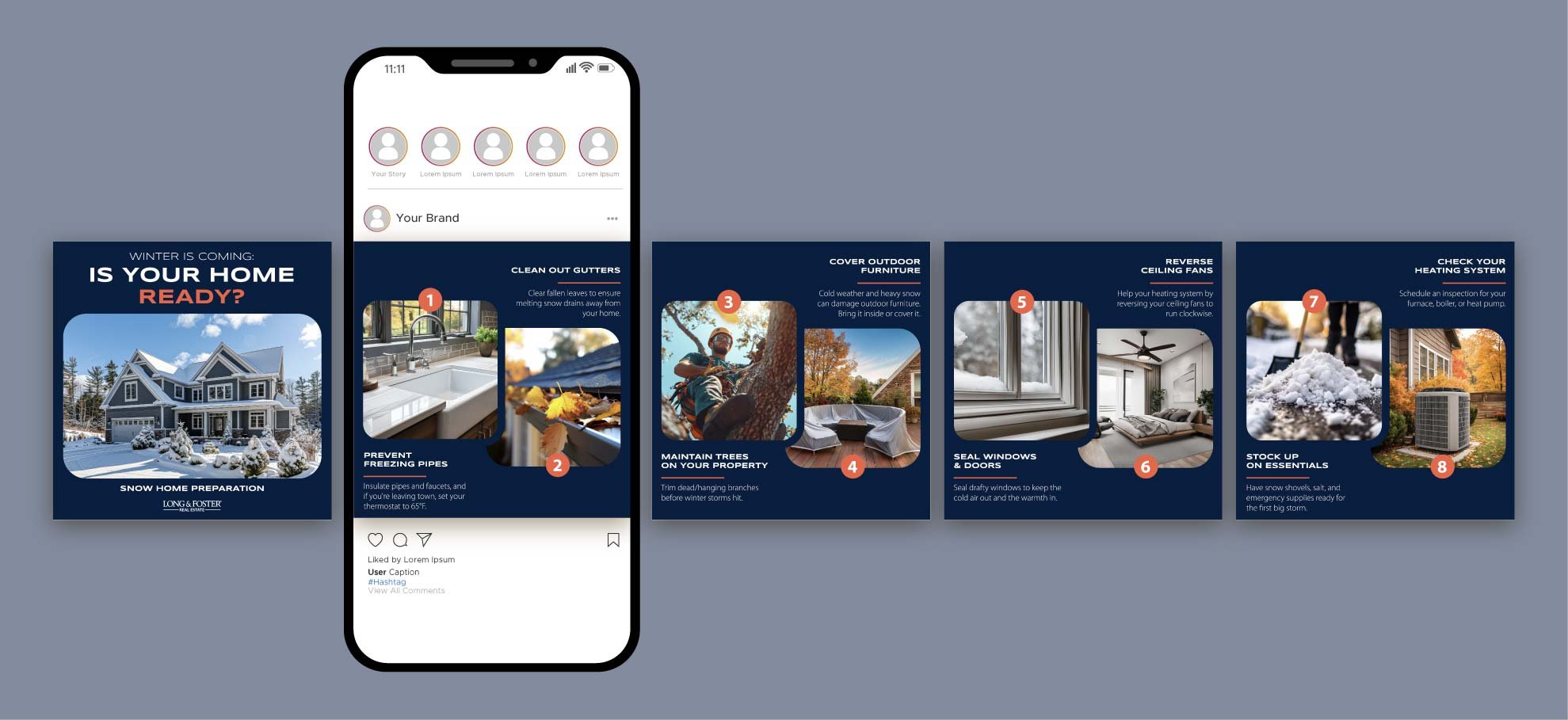
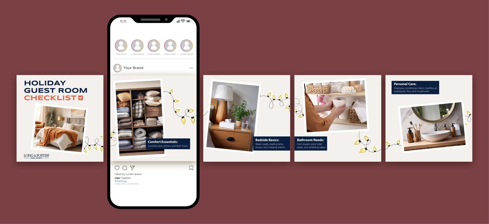
Each design has been perfectly crafted with functionality in mind to show off every home and highlight the most important features at a glance. The minimal color palette allows for the color navy to pop & draws the attention to important information and simple decorative iconography adds to the timeless aesthetic, and the traditional photogrids show off the best features of every type of property.
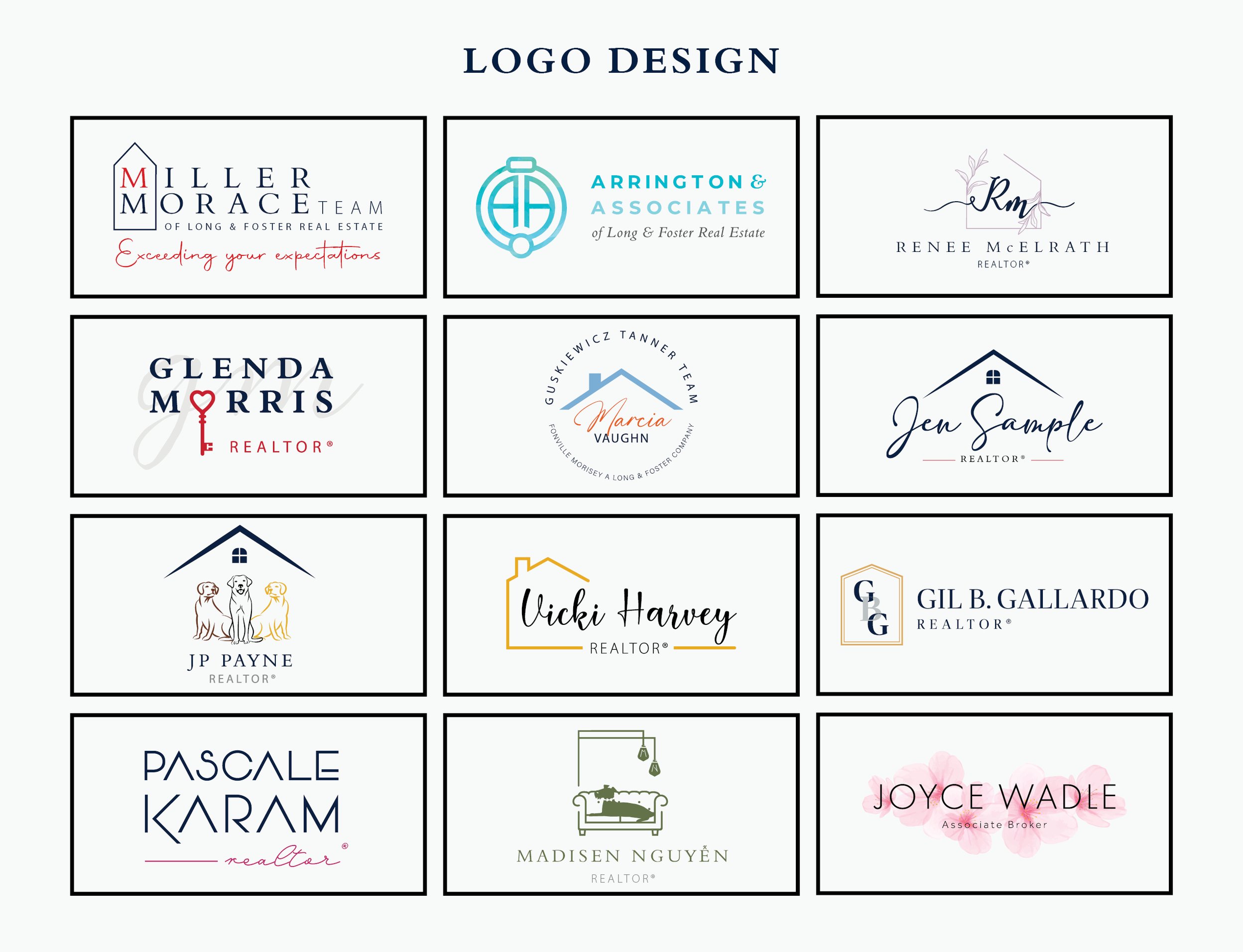
Real Estate logos for different agents & groups. Each one personalized to fit the agent’s personality/branding.
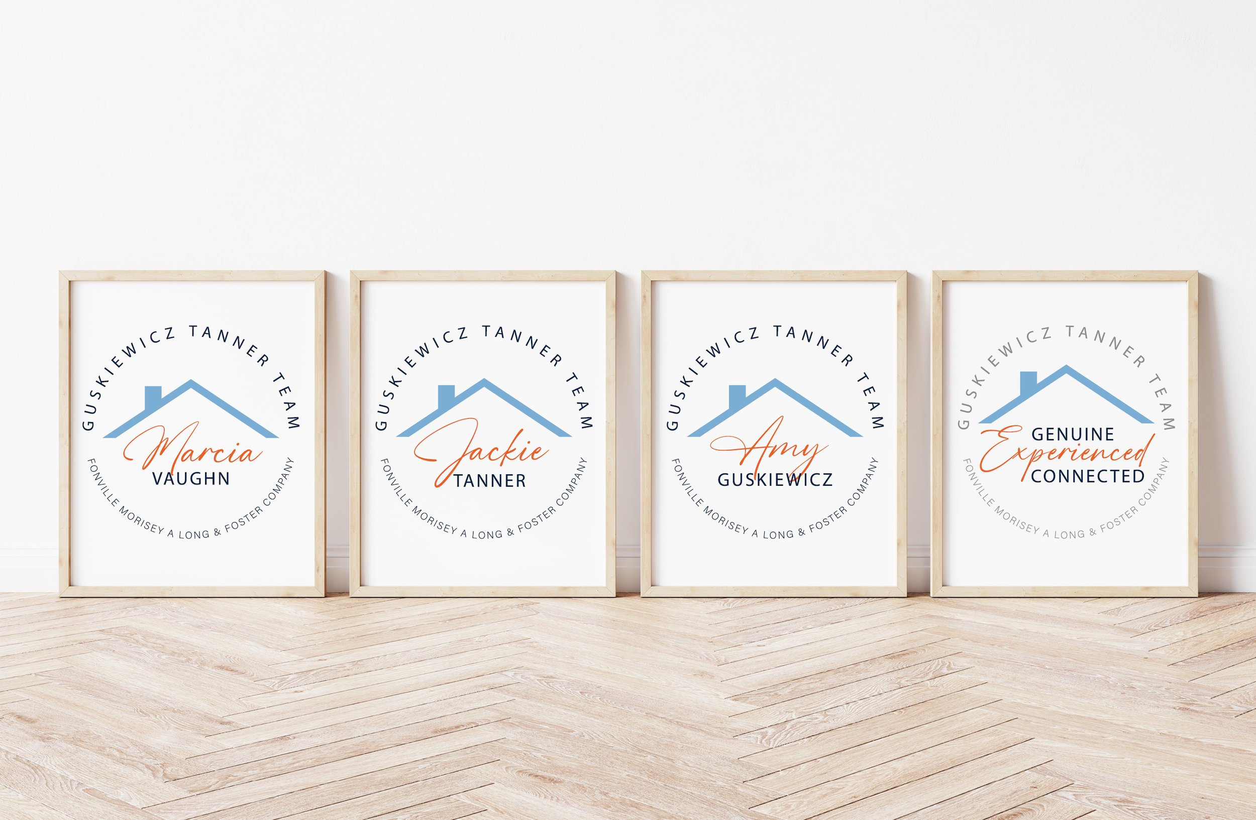
The Guskiewickz Tanner Team was looking to revamp their old logo and for it to be more personalized. It was a fun project to work on with three different styles and point of views. I was able to create a cohesive logo different enough for each agent to stand out, and similar enough to be one team.
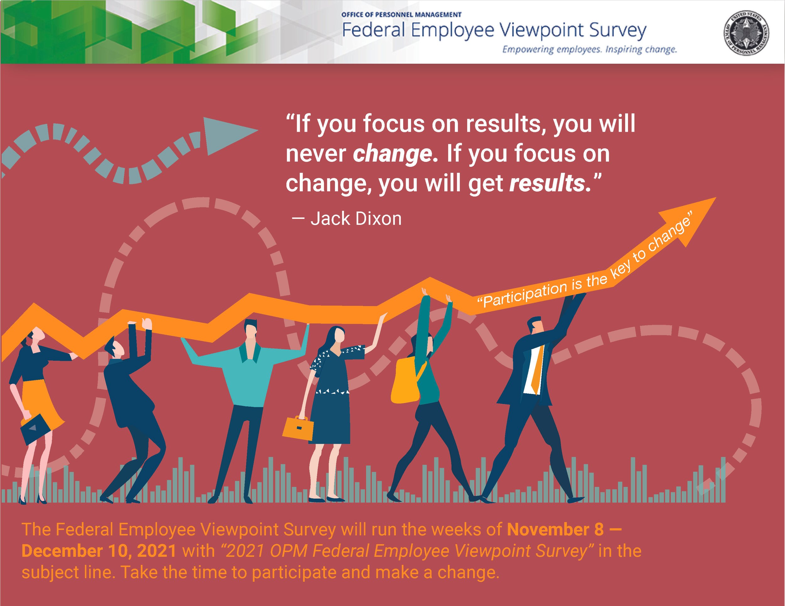
Federal Employee Survey - part of a series
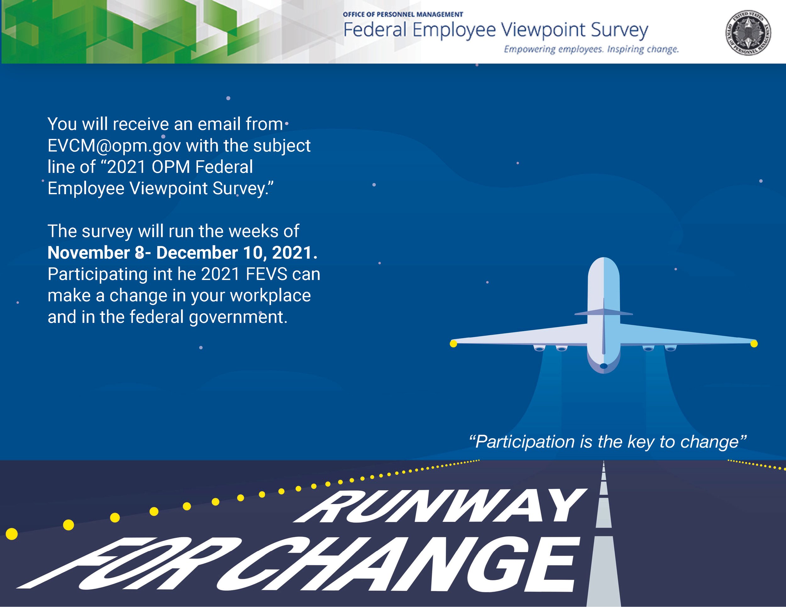
Federal Employee Survey - part of a series
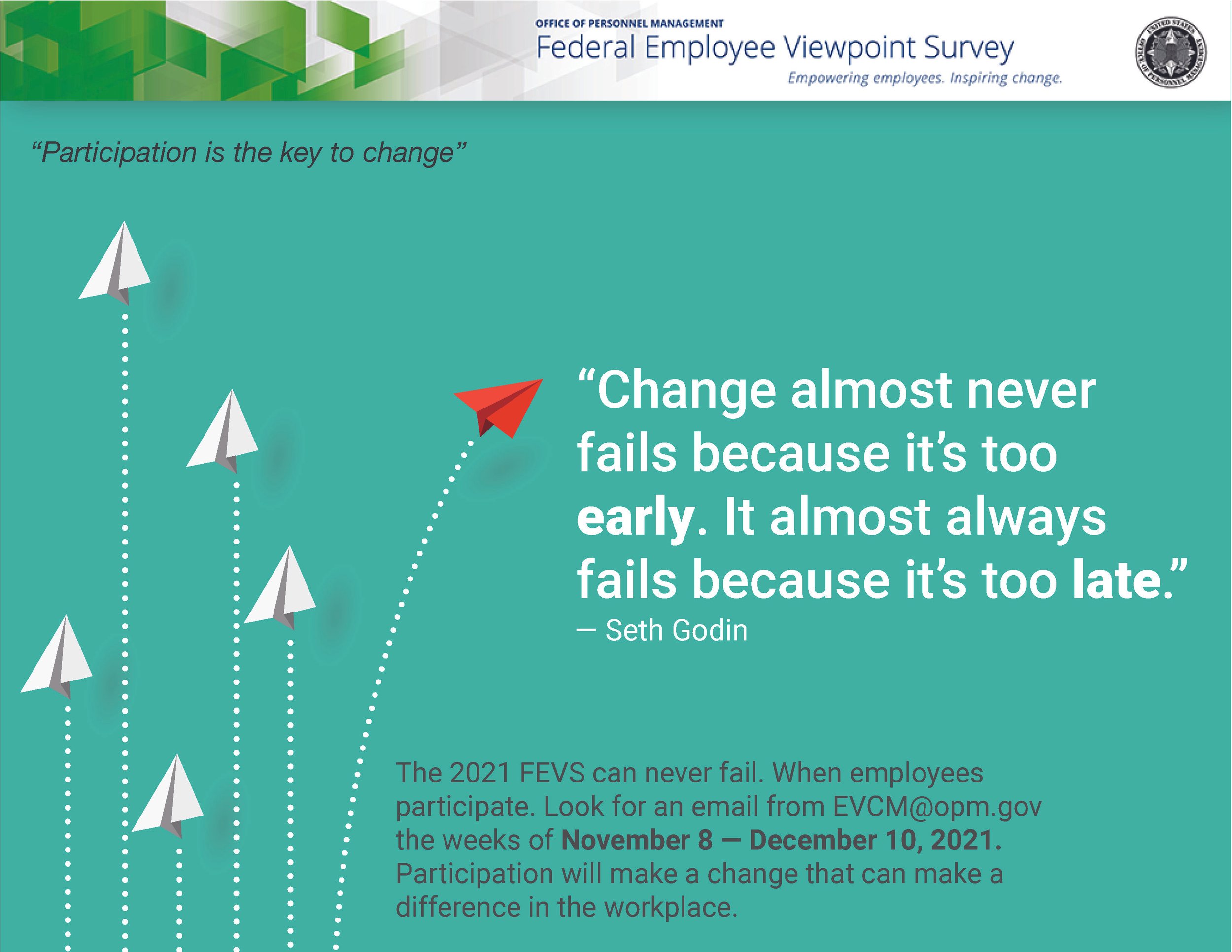
Federal Employee Survey - part of a series
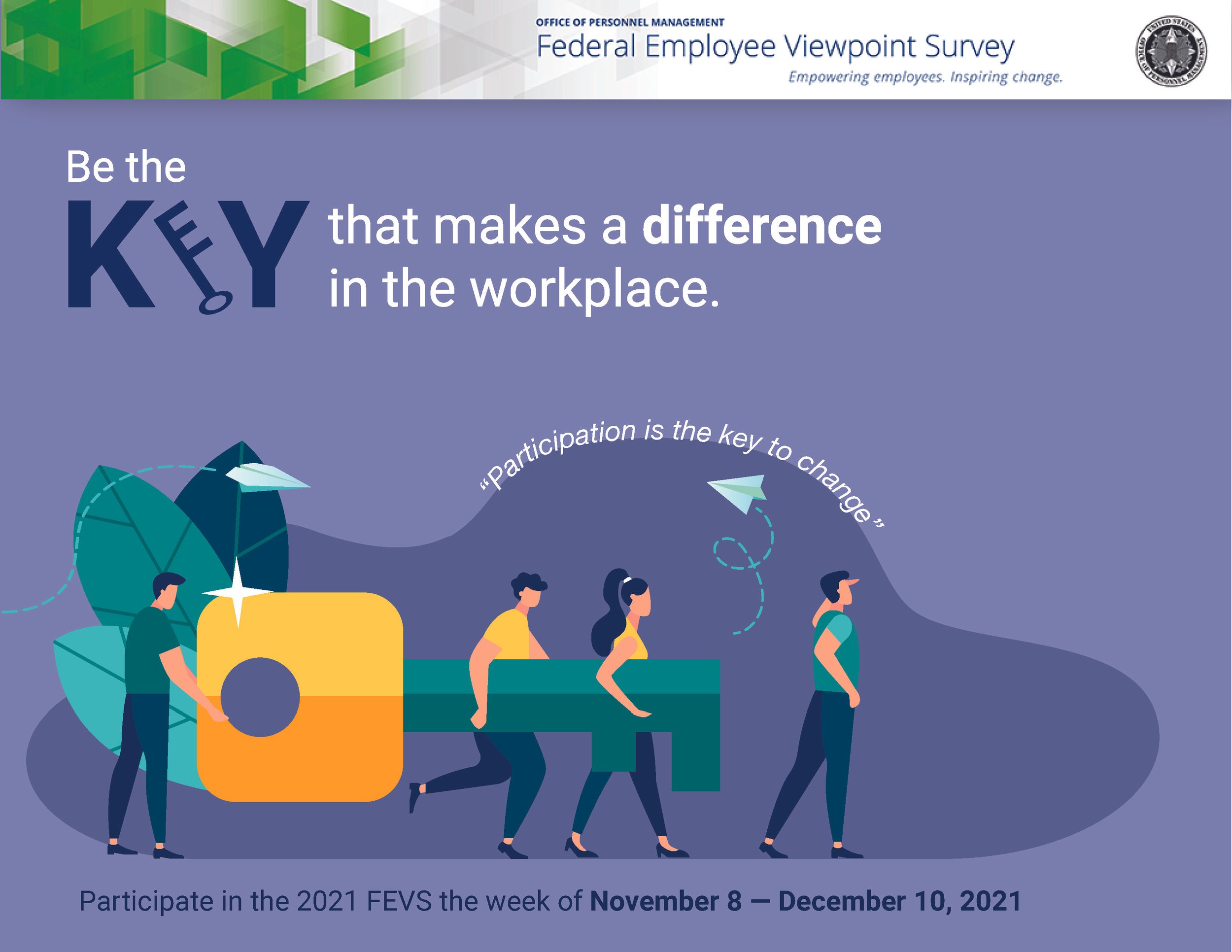
Federal Employee Survey - part of a series
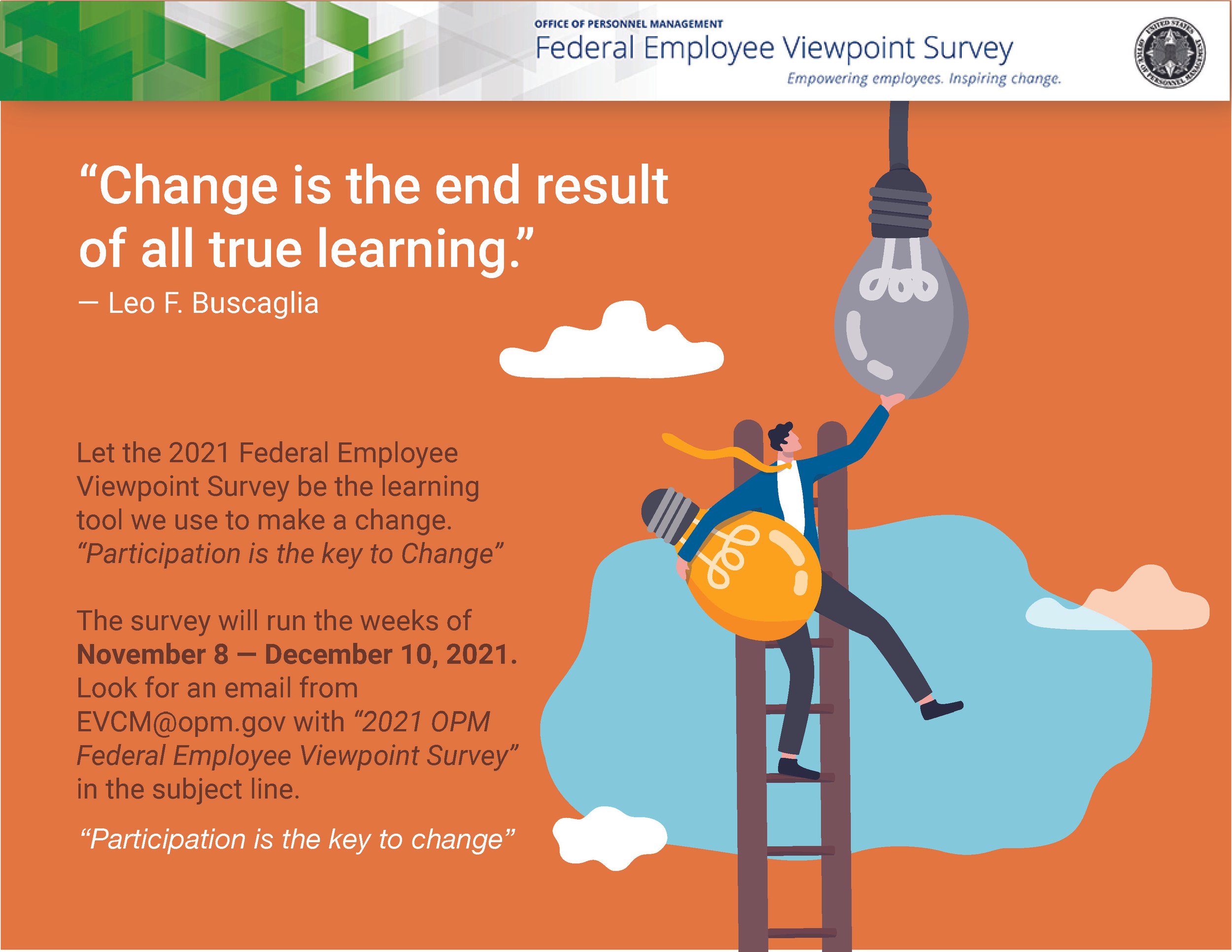
Federal Employee Survey - part of a series
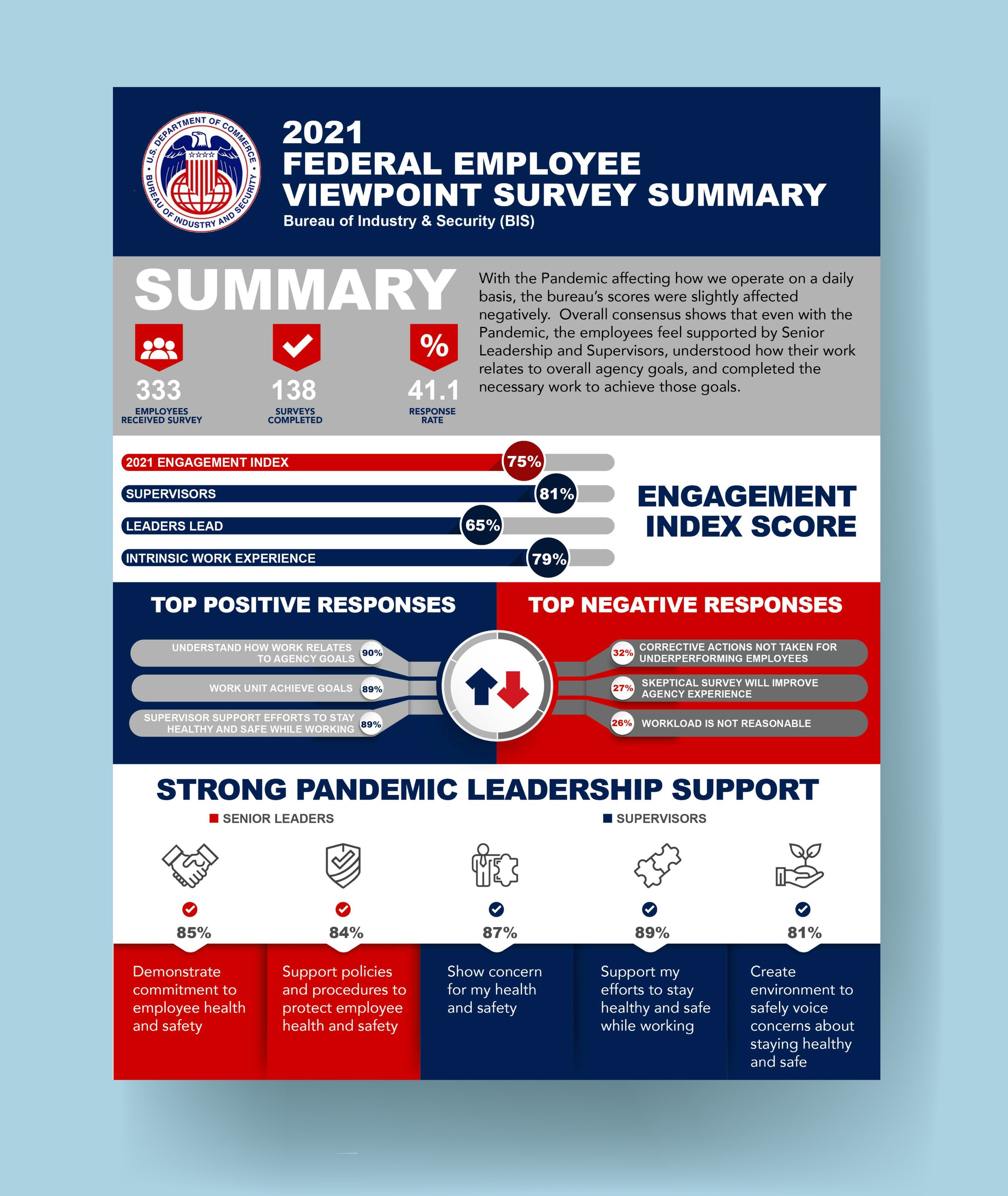
Developed visually striking marketing materials, including logos, brochures, newsletters, infographics, presentations, and advertisements, exceeding the Department of Commerce’s expectations.
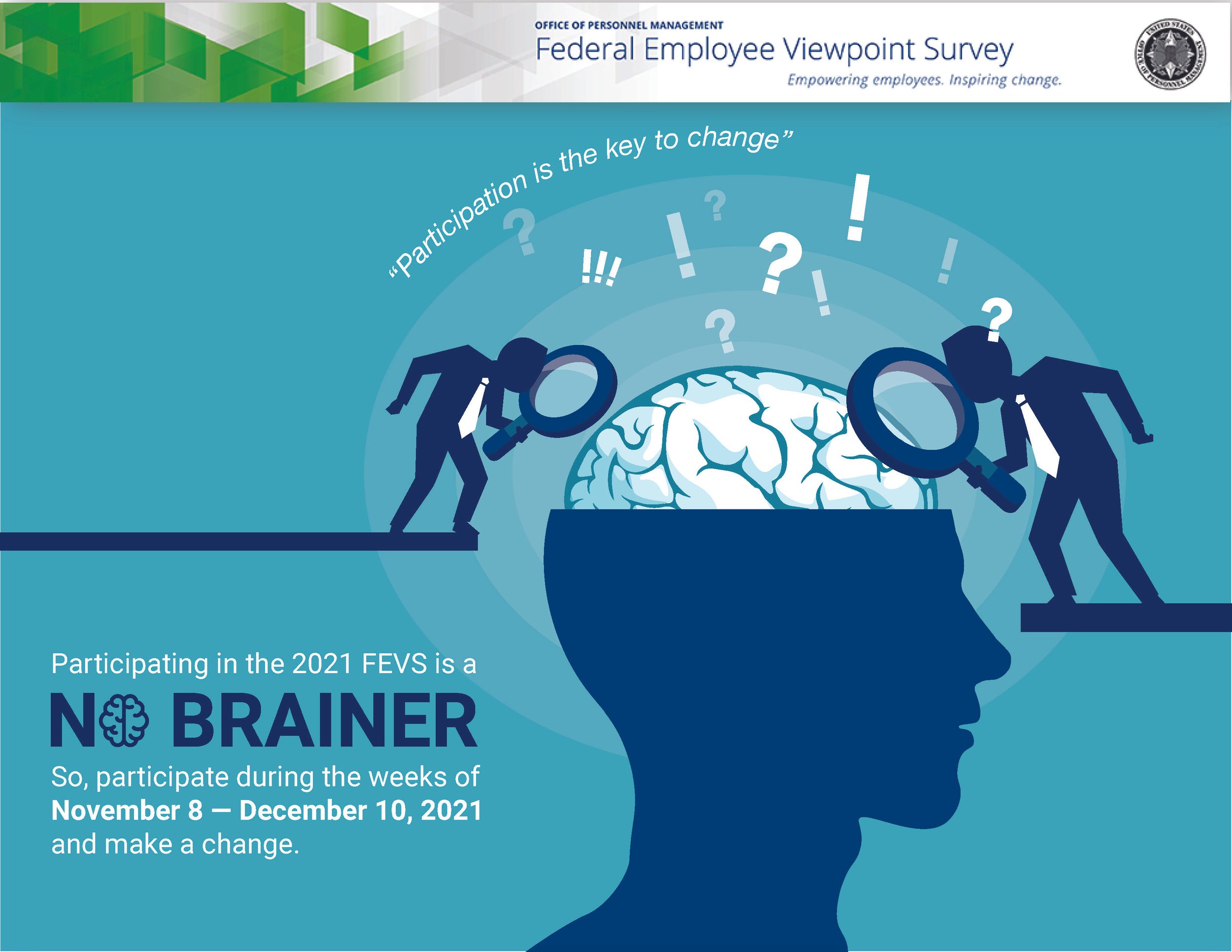
Federal Employee Survey - part of a series